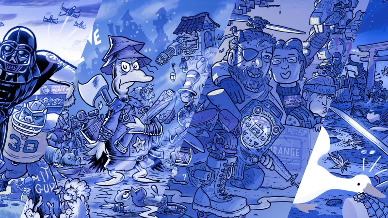
Our April Fool’s Day tradition around here is Game Infarcer – a parody magazine featuring fake games, pretend news, and even a non-existent editor-in-chief. This year’s edition went online today, including a wonderful illustration of Resident Evil IX by artist Zander Cannon. But if you’ve been reading Game Informer for a while, you know that this isn’t the first time Zander has created the cover for Game Infarcer. In fact, this is the 16th consecutive year we’ve collaborated with him on this project.
To celebrate such a long history, I got together with Zander, my colleague Ben Reeves, and former GI editor Jeff Cork to take a stroll down memory lane. The four of us worked together on the majority of these covers, so we traded stories about all 16 of them. In this retrospective, we share our recollections on all things Game Infarcer, from the origin of the core cover concepts to the technical details of creating the illustrations.
Halo 3
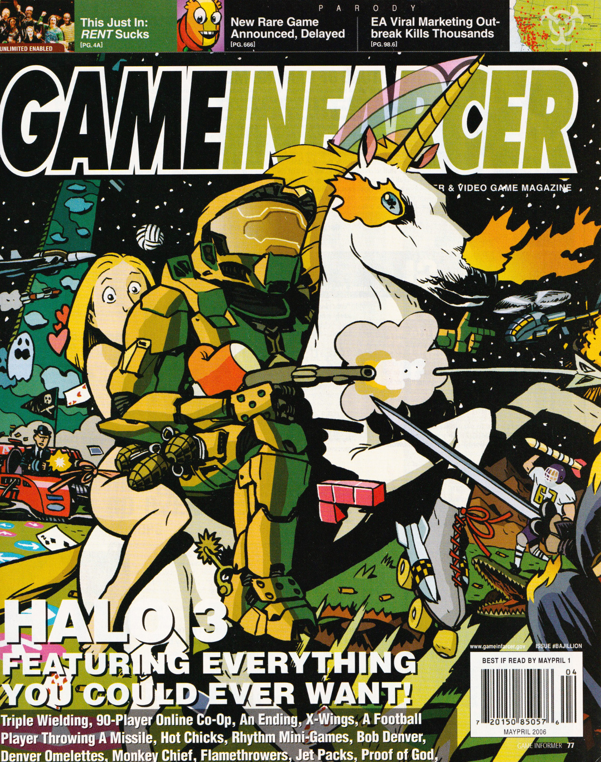
ZANDER: So, the first thing is: I got hooked up with you guys through [former Game Informer editor] Jeremy Zoss … I was really unhappy with all the stuff I was doing in my career, so when I heard: “We’re going to do an illustration, and it’s going to be about Halo 3,” I was like, “Oh my god. This is going to be hilarious and awesome.” And I knew that I had to triple-over-deliver. You guys had this absurd, overstuffed concept – basically everything written at the bottom of this cover – so I was like, “Yeah, I can do that, and plus some.”
JOE: As I remember, our idea for this cover was to overpromise on everything anyone could ever want for a video game with Halo 3, because expectations were so high. But I like how your angle expanded that to more of a “Let’s include all of that, plus every video game ever.” And then some things weren’t even video games. Like, just regular old games.
ZANDER: With the playing cards? Clearly, I had hit the edge of my ideas there. But I also remember Jason Jones [from Bungie] saying something like, “If Halo 1 is like this, then Halo 2 is Halo 1 being chased by helicopters and ninjas through a hospital zone, and the ninjas are on fire.” So I added that ninja on fire on the right-hand side. That’s a deep cut for people who pay attention to the gaming press.
JOE: Zander, I wanted to ask: Since this is the first cover you did for us, what about the art stands out to you? If I were to read something I wrote in 2006, I would just cringe the whole way through it. What makes you cringe here?
ZANDER: I’ll stand by this one. It’s got the main thing right in the center, and it’s reasonably well-constructed. I’ll be cringing way more at the other ones. I was pretty happy with this as a debut, though it’s a bit sloppy. I’ve certainly cleaned things up in the intervening years, but this one’s okay.
Metroid Prime Xtreme
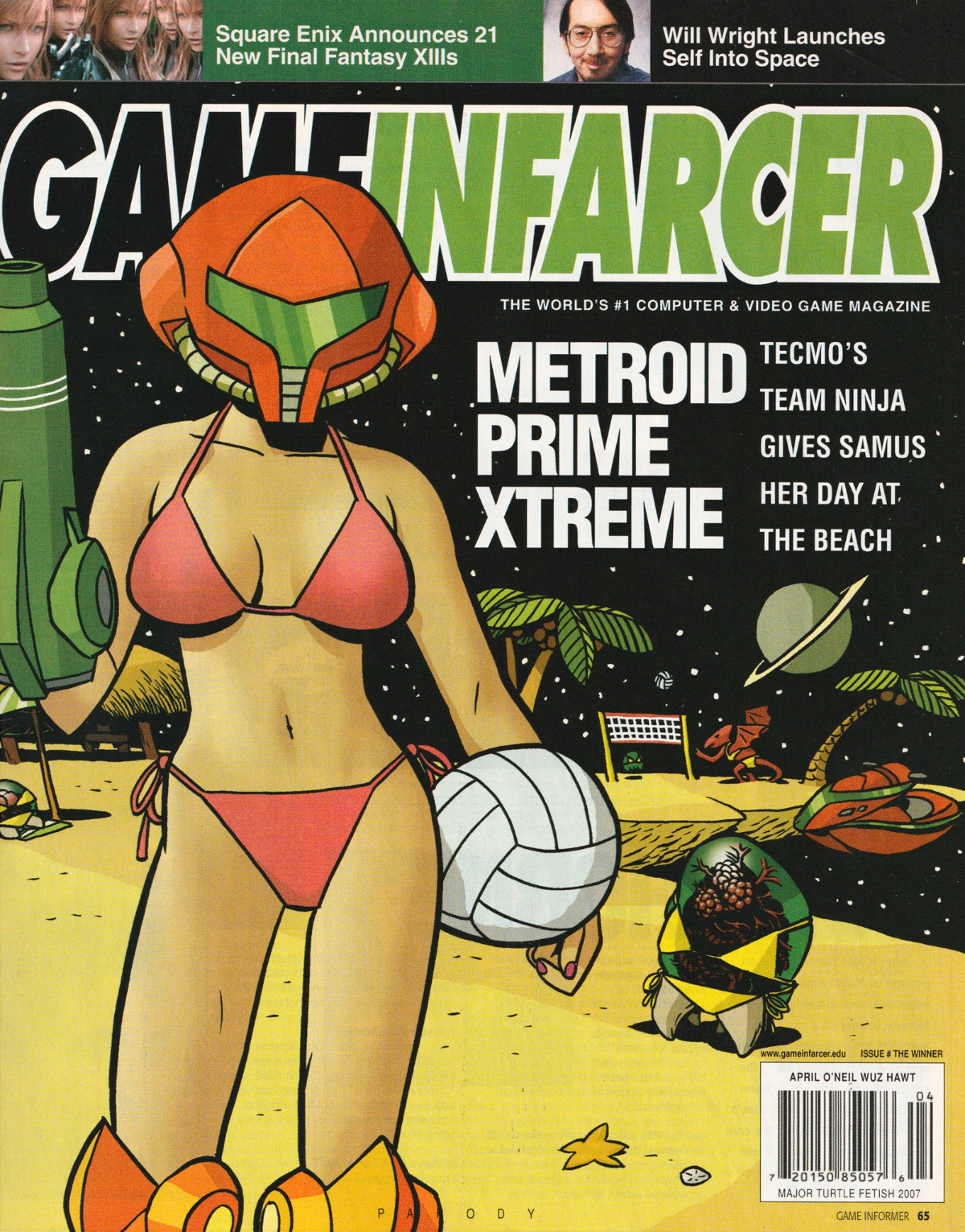
JOE: You might think you know what gave rise to this joke. “Oh, it’s Team Ninja’s sexy take on Samus, because the studio was actually working on Metroid: Other M.” Except this was early 2007, and Nintendo had made no announcements about Other M. We had no idea it was happening. It’s pure coincidence that Team Ninja actually made a Metroid game later.
ZANDER: So the joke was just, “Remember Samus is a lady?”
JOE: Yeah, basically. In these 16 years of Game Infarcer covers, I think this one is just the absolute weakest in terms of general concept.
BEN: This was the first year I worked on Infarcer, and I remember thinking the idea was not that strong.
ZANDER: I’ve never been known for my ability to draw sexy pin-up girls … I remember doing this and thinking, “I can do it, but I don’t know that this is something I’m super-stoked about.” Although I thought it turned out great – just maybe a little too sexy.
JEFF: I like the Metroid in the background in a bikini. That’s cute.
ZANDER: Yeah, Metroids in bikinis is much more my style.
JEFF: Did you get to re-use the star field in the background from the first cover and save a little time there?
ZANDER: Oh, I wish. These two were both done on paper. And not even very good paper. So I had to draw the stars, and do the inking all around them. It’s so laborious, and not fun at all. And there’s no real payoff!
JOE: I think it’s funny comparing this one to the previous year … that one was just packed, and this one is just barren space, a barren beach. That’s no fault of yours, Zander. We just didn’t formulate the jokes to hide in there.
ZANDER: If I were doing it now, I’d want a bunch of characters, a bunch of gags. I’d do a lot more research; I hadn’t really played Metroid games or Dead or Alive games – the fighting ones or the volleyball ones.
JOE: I think you gave this the appropriate amount of effort.
Assassin’s Creek
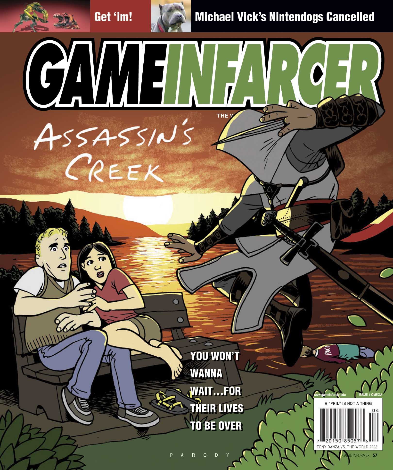
ZANDER: For one thing, I’m not a good caricaturist, as you can see. Those could, very broadly, be those characters. But they’re not obviously James Van Der Beek and Katie Holmes. I’m not always known for knowing my limitations, but I did in this case.
JEFF: You nailed Pacey.
ZANDER: Listen, man, sometimes you’re backed into a corner. This is actually the cover that the GI production team altered. In my version of this, the two Dawson’s Creek figures are darkened in the same way the assassin is, because the sun is behind them. But they lightened them up.
JEFF: This really benefits from the fact that we’re looking at something so old. Because we just take for granted that this must have been relevant at the time. But really, this whole joke was well past its expiration date at the time of publication.
JOE: I just looked it up. Dawson’s Creek ended in 2003, so this is a good five years after that.
BEN: The whole point was just the pun. This was back when all we needed was a strong pun – or even a not-so-strong pun – to run with. Once came up with that “You won’t wanna wait” tagline, Joe was like, “That’s it. The cover is done.”
ZANDER: From an art perspective, I was still doing all the line art on paper. But I added that orange hillside, and the yellow one further back, to give more atmospheric perspective. I remember thinking I was pretty clever for that. And the rendering on the clouds is pretty poor, but I was starting to figure out how to be a bit more sophisticated with my color. Every year, Game Infarcer was always my opportunity to try out a couple new tricks, color-wise. [A Game Infarcer illustration] was something I was going to get to spend more time on, so I could tinker with it. All the rendering of the sun on the water – you can tell that took a while, and I had the time to play with it.
JOE: And even though we give ourselves grief for the basic concept of this cover, I think it actually looks great.
ZANDER: If you cover up their faces, then I’d really like it.
Braid II
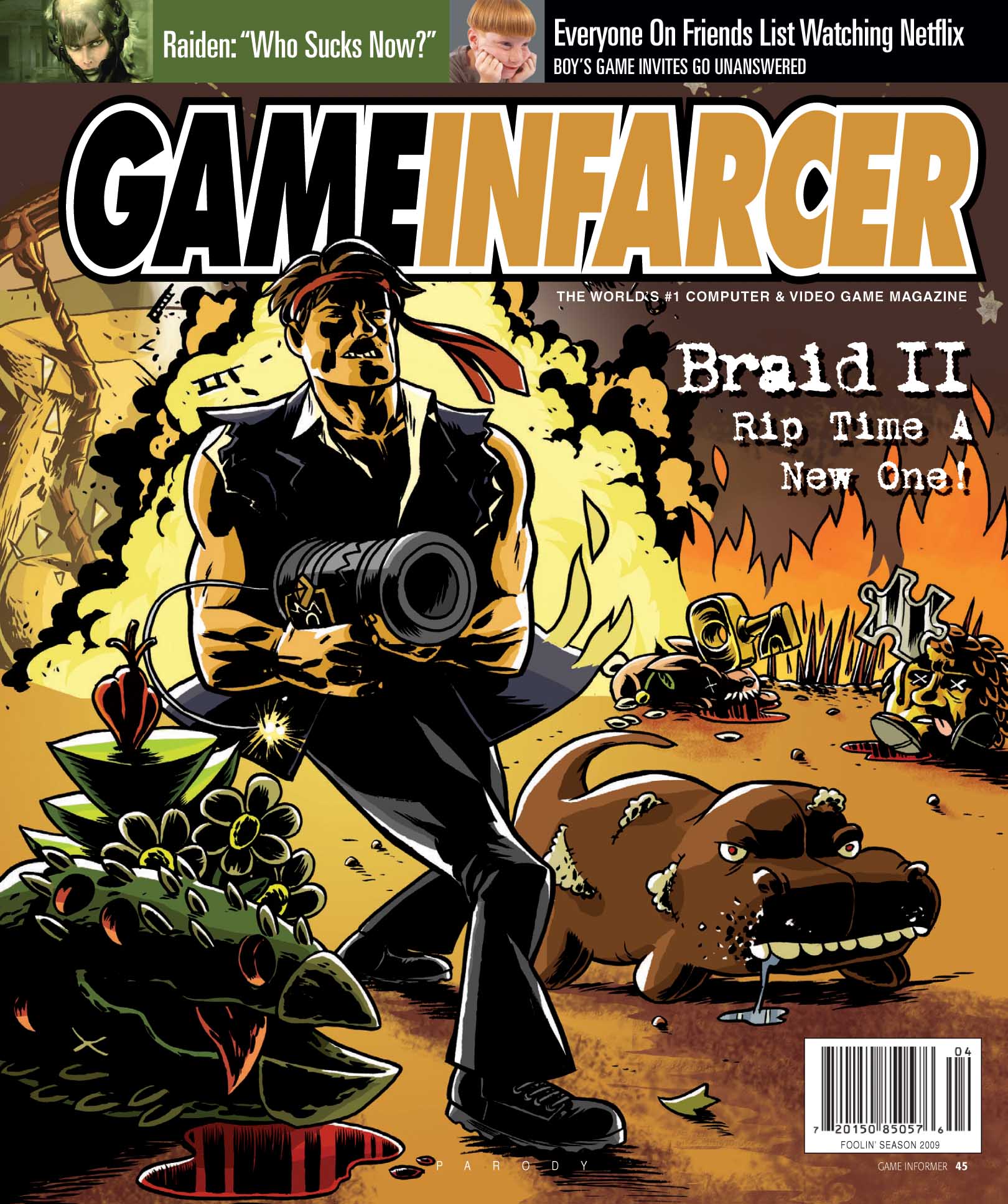
ZANDER: This is my first one since the Halo one where I was very familiar with the game. I played the heck out Braid and loved it.
JOE: I remember that we changed the text to “Rip time a new one” at the last minute. The cover originally said “Braid II: Time Harder.” I still like that one better, since it was like Die Hard 2: Die Harder. But visually, I think the action-movie-poster vibe is great here.
ZANDER: In a way, I kind of wish I’d drawn Tim more like he was in the game. With a big head. I was focused on getting him all muscled up, but it might have been a funnier piece if I’d made him more like he really was, but meaner and with blood on his face. If he was more recognizable as that character.
You know, you play Braid, and you just hate those stupid bunnies, so I was like, “I can’t wait to crush that bunny’s skull with a cool-looking key.” The Swiss-cheese holes in the plant, that was my homage to Fearless Fosdick in Lil’ Abner. I liked doing that explosion, too. And there’s a whole bunch of stars and stuff, like the ones in the game, that are behind the logo.
JOE: But nothing here that’s making you cringe yet, looking back at your old work?
ZANDER: No, this one isn’t so bad. But there’s one I’m really going to cringe at. That’s coming up soon.
JEFF: The only thing I remember is that this was my first contribution to Game Infarcer. I wrote the “Everyone on friends list watching Netflix” snipe. Because I think I was still on the online team at this point, so I didn’t do a lot of stuff for the magazine.
ZANDER: I think this was the first year that social media got ahold of the cover, because I remember Jonathan Blow posted something about it. Like, “We have a sequel coming soon,” and then attached a photo of our gag cover.
BioShock 3
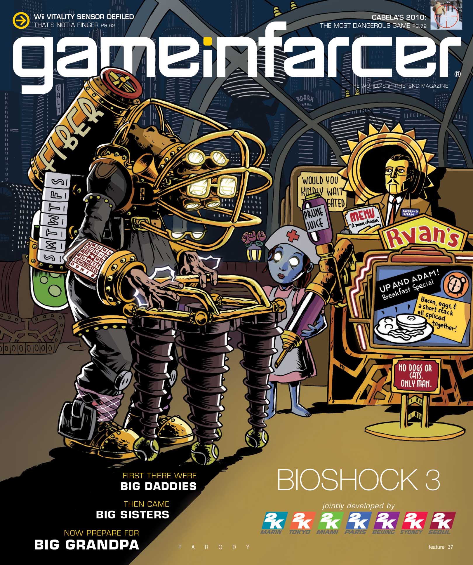
JOE: This is one of my favorites.
ZANDER: Yep.
BEN: Me too.
JEFF: Absolutely.
JOE: When I think of our best covers, I think of the ones that are immediately recognizable as the featured game, but then they have a twist that reinvents or reframes it.
ZANDER: And this one takes the two data points – the Big Daddies and Big Sisters – and obviously the next step is Big Grandpa. It’s that perfect escalation of the concept. I remember being really excited about that. And Joe, you loaned me a Big Daddy figure, which was so helpful. Because you can find pictures, but they never have, like, the bottom of the tank and details like that. I also remember I had a normal “Please wait to be seated” sign, and it was Jeff Cork who suggested we change it “Would you kindly wait to be seated.”
This was the year Jeff Marchiafava reached out and asked if I was able to do the cover, but asked if it would be possible to draw it a little bit more realistically. And I remember saying, “Oh yeah, absolutely.” And I drew it the same as I always drew it! That’s my secret – saying, “Oh yeah, absolutely.” One thing I did do is I rendered out the shadows with a little more detail, and that has the effect of seeming a little more realistic.
BEN: One reason for that request about realism might have been tied into the Game Informer redesign. This is the first year with that new logo – we may have been asking “How does Game Infarcer fit in with the redesign of our magazine?” I remember having a conversation about that.
I remember we actually spent some time thinking about what this cover would look like ahead of time, too. What the Big Grandpa would look like. Usually we’d just come up with the concept.
ZANDER: Yeah, Joe, I think you might have even given me a sketch. That really helped, because you guys had a sense of what might fill out the space. I think one of the reasons this one works so well is that there’s nothing really happening except this character design and a bunch of stuff around him to fill out the visual story.
JOE: The other thing I remember about this cover is someone from 2K reached out to our boss – I don’t remember they talked to Andy [McNamara] or [Andy] Reiner – but they called to complain that our joke about all the 2K studios was too mean.
BEN: And today, that’s just modern game design.
ZANDER: Can someone explain to me the “Android Ryan” joke? Is it just because it sounds like “Andrew Ryan”?
JEFF: Yeah, and it was supposed to be a Chuck E. Cheese-style mascot.
Uncharted 4
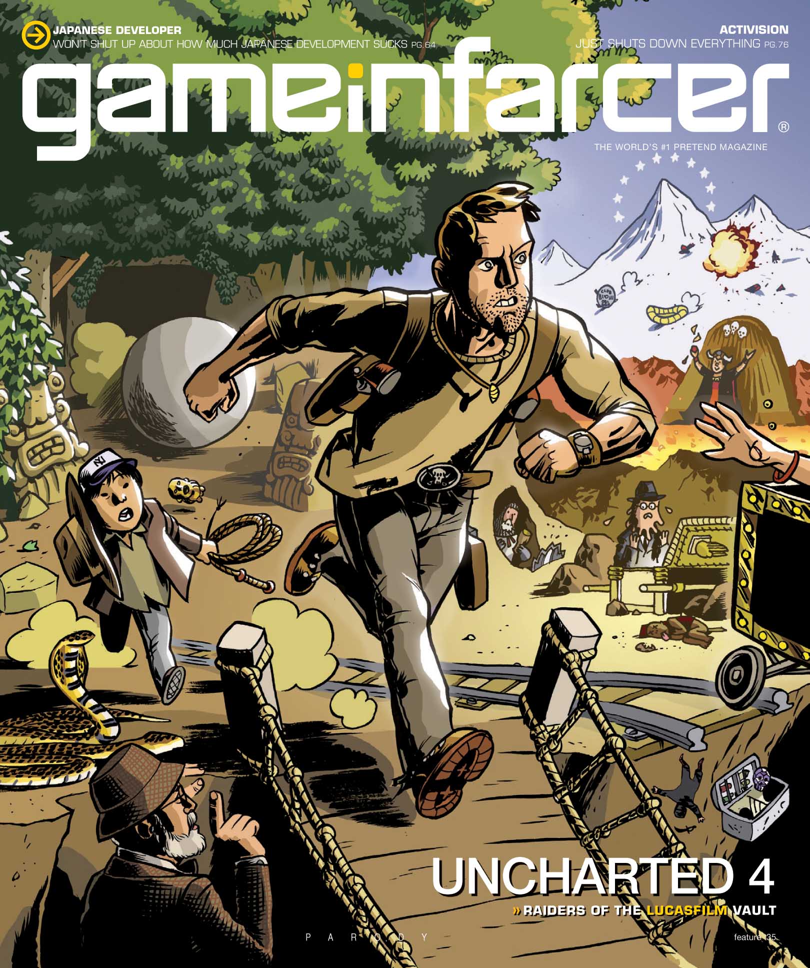
JOE: This is not one of our best concepts.
ZANDER: There are a million things in there. You have the Paramount stars, the raft, the Club Obi-Wan. There are a million Indiana Jones jokes. But there are no Uncharted jokes … one reason being I hadn’t actually played Uncharted at this point. I didn’t have a PS3. And it’s not like I’m a caricaturist – if I had nailed what Nathan Drake looked like, maybe that would have been different.
BEN: You got the untucked shirt! And I think it’s good … I think it conveys the Uncharted part.
JOE: I remember feeling like that this was a slam-dunk at the time, but looking back on it now, I really feel what Zander is saying. It’s just random Indiana Jones things. Which is what we wanted and asked for, but..
BEN: I think, after that BioShock cover, this is when we also started to be conscious of the fact that we wanted concepts with lots of gags. This one had that potential, but we maybe didn’t have a strong enough concept.
ZANDER: And all of the gags are from one thing. “Oh, that’s from Indiana Jones. And there’s another one from Indiana Jones.” The BioShock one was lots of jokes about old people, but those don’t all come from the same place. But I think this is a solid cover. It’s not my best drawing or anything, but it’s okay.
JOE: Does anything stand out as memorable or fun to work on here?
ZANDER: It was fun to draw Short Round. I like the pose he’s in. But I was doing a lot of those big black areas, and that made it really hard to get this depth of field. There’s stuff that I obviously inked in black, but I just screened down so it’s dark gray or whatever. That gives a sense of the depth, but it’s not as effective as if I had just made it line art and colored it darker. I was still learning about how to do something sophisticated with depth-of-field.
JEFF: It kinda looks like Nathan Drake is bowling!
BEN: The Paramount stars are my favorite.
ZANDER: Yeah, that joke, I think, has the right degree of subtlety. It definitely isn’t subtle, but it has the right amount of subtlety.
BEN: I also like the joke up top about the Japanese developer complaining about how much Japanese development sucks. It feels like that was definitely a theme in the industry for a while.
Mortal Kombat vs. Warner Bros.
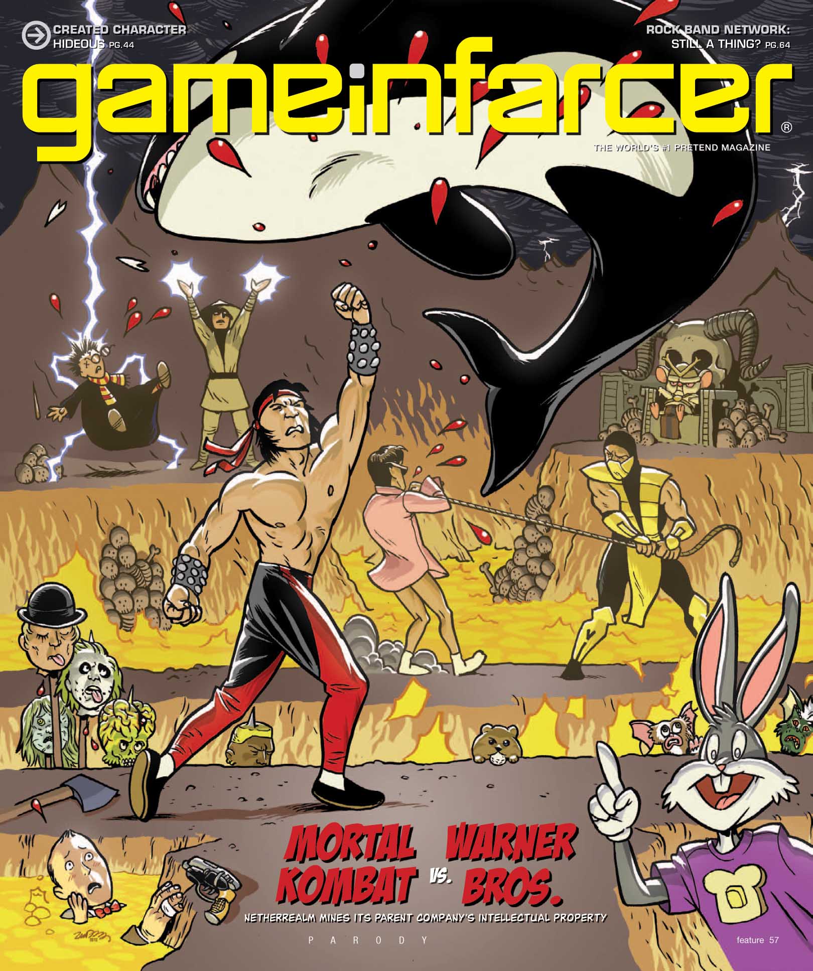
ZANDER: I remember an argument – I think I permanently made an enemy of Dan Ryckert – because I was like, “Warner Bros.? That means Looney Tunes!” So I wanted to make it heavy on Looney Tunes. And Dan was like, “No, there’s all these WB movies. Let’s do that!” And when I got back to the studio and started drawing, I realized that he was correct, and the original [WB] concept was stronger. But I think Dan was like, “Who is this argumentative cartoonist?”
JOE: But now, looking at what Mortal Kombat has become, this is not as far-off or ridiculous as we thought it was at the time. They’ve had guest characters now like RoboCop, Rambo, and Freddy Krueger.
ZANDER: I still think they should put in the Gremlins.
JOE: Is that Pee-Wee Herman in the lava?
ZANDER: Yeah.
BEN: What about that hand?
ZANDER: That’s Deckard’s hand. And gun. There’s Alex from A Clockwork Orange on the spikes, the girl from The Exorcist, Beetlejuice, Mars Attacks, Wesley Snipes from Demolition Man. And that’s the gopher from Caddyshack. And a core part of the whole concept was that Risky Business Tom Cruise doing the “get over here” slide. And I did the toast on Bugs Bunny’s shirt as a nod to the Toasty Guy from Mortal Kombat.
I did all the pencils on one sheet, but this was the first cover where I had inked all of these characters in separate stages, so they were different layers. So I could go, “One layer back has a bit of orange in front of the line art, so that’s a little bit lighter, and things further back are a little lighter. So I could distance things out by how much haze there was in the lava.
But I am very proud of this Liu Kang pose. It looked effortless, in a way I didn’t feel about Nathan Drake. It’s pretty much what it would look like if you were giving an uppercut to Free Willy.
JEFF: I like the fact that you were just like, “People are going to have to figure out what this is.” You didn’t put a tag on his flipper saying “Free Willy” or anything.
ZANDER: It’s mostly covered up by the background, but there’s a sinister sky with clouds and lightning there. The funny thing is, I had done somebody’s wedding invitations for them, and I did this whole sky for that. So I just reused the sky I made for a wedding invitation here. And I’m so glad I did, because you barely see the sky in the final version.
The Walking Dead
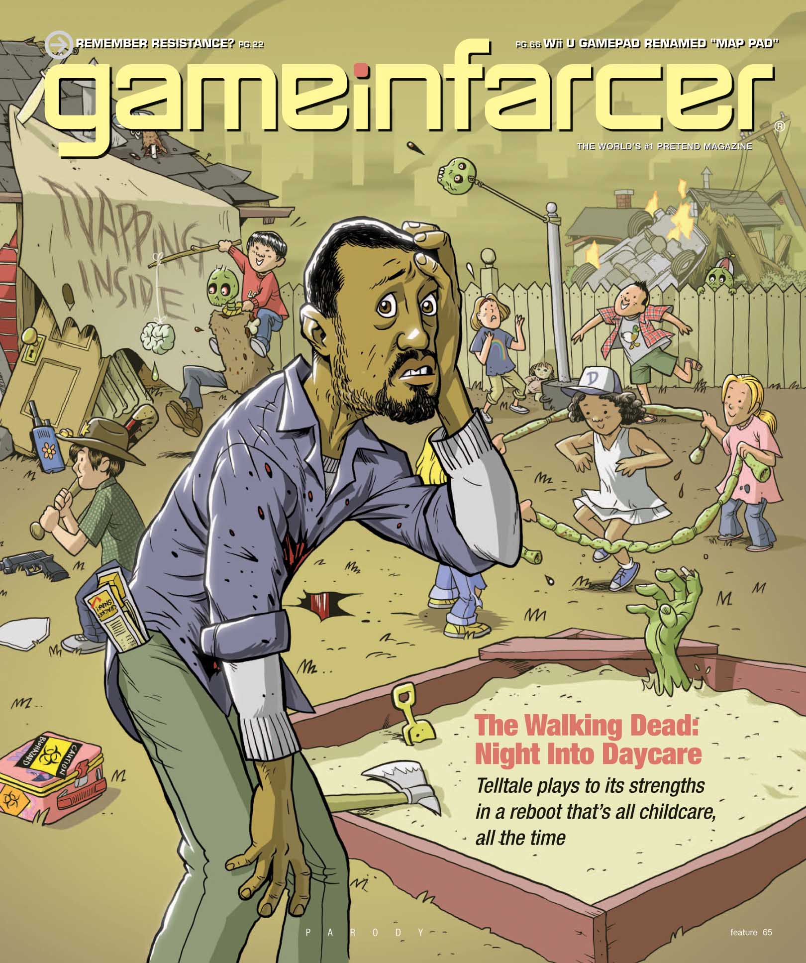
BEN: The original concept here was “The Walking Dad.” I think that was a Tim Turi suggestion. But it was so pun-heavy, and we had started to move away from that. So we dismissed it, but came back to it later and renamed it.
JEFF: Yeah, that’s how I remember it.
JOE: I think we had “Dad Island” as a preview in this edition, instead.
BEN: For several years, we started to be very anti-pun. Or at least, we decided that there needs to be more to the joke than just a pun.
JOE: Assassin’s Creek wouldn’t have made the cut in this era.
ZANDER: And for me, I always wanted to make sure it was a good fit for my style – something that is on-brand for me. Like, something that is going to hinge on a good caricature, or look super badass, that’s not why you’d want to hire me. But something that is silly, choked with detail, and has a lot of deep cuts, that’s why I’d be there. I’d rub my hands in anticipation for that stuff in my wheelhouse.
JEFF: It’s funny that you mention caricatures, because you’ve got your son in there riding on the zombie.
ZANDER: You know, that could be any child, basically.
JEFF: Uh huh, okay.
ZANDER: One other thing: This is the first Game Infarcer cover that I digitally inked. I don’t think it’s that obvious, but you’ll notice that there are almost no solid black areas, because I knew I was going to do that in color.
And I’m really proud of that zombie hand in the sandbox. I feel like that’s a solid-looking hand.
Madden 1313

ZANDER: This is such a cool concept, and I am so unhappy with how I drew Darth Vader. I don’t really think the illustration is up to the quality of the gag. I mean, it’s fine. There’s nothing wrong it. But I wish I had delivered more.
JOE: Really? That is immediately recognizable as Darth Vader!
ZANDER: Oh sure, you can tell it’s Darth Vader from a mile away, no matter who draws him. But he’s this great, iconic character, and I don’t feel like I did him justice. I would have redrawn that helmet a bit. But looking past him at all the gags, there are some solid ones back there.
BEN: I love those lightsaber goalposts.
JOE: The floodlights are blocking them a bit, but I always liked the AT-ST tailgaters.
JEFF: And is that Akbar getting blue milk dumped on him?
ZANDER: Yeah! But from R2D2.
JOE: You know, of all the dumb game ideas we’ve had on Infarcer covers, I would love Star Wars football to be real. I want to play this game.
ZANDER: Totally. That would be awesome.
BEN: Over by the goal posts, what’s that “D4” about? Is that some sort of Star Wars convention?
ZANDER: No, sometimes you see a D and a fence at football games, for “Defense.” So that’s a D and two fours. “D Fours”
JOE: “The Force!” Wow.
ZANDER: This Star Wars cover was the one I was most embarrassed to revisit, but now that we’ve gone through it, I’m like, “It’s fine.” But if I had redrawn that Darth Vader, I really would have loved it.
A Link Between Everything
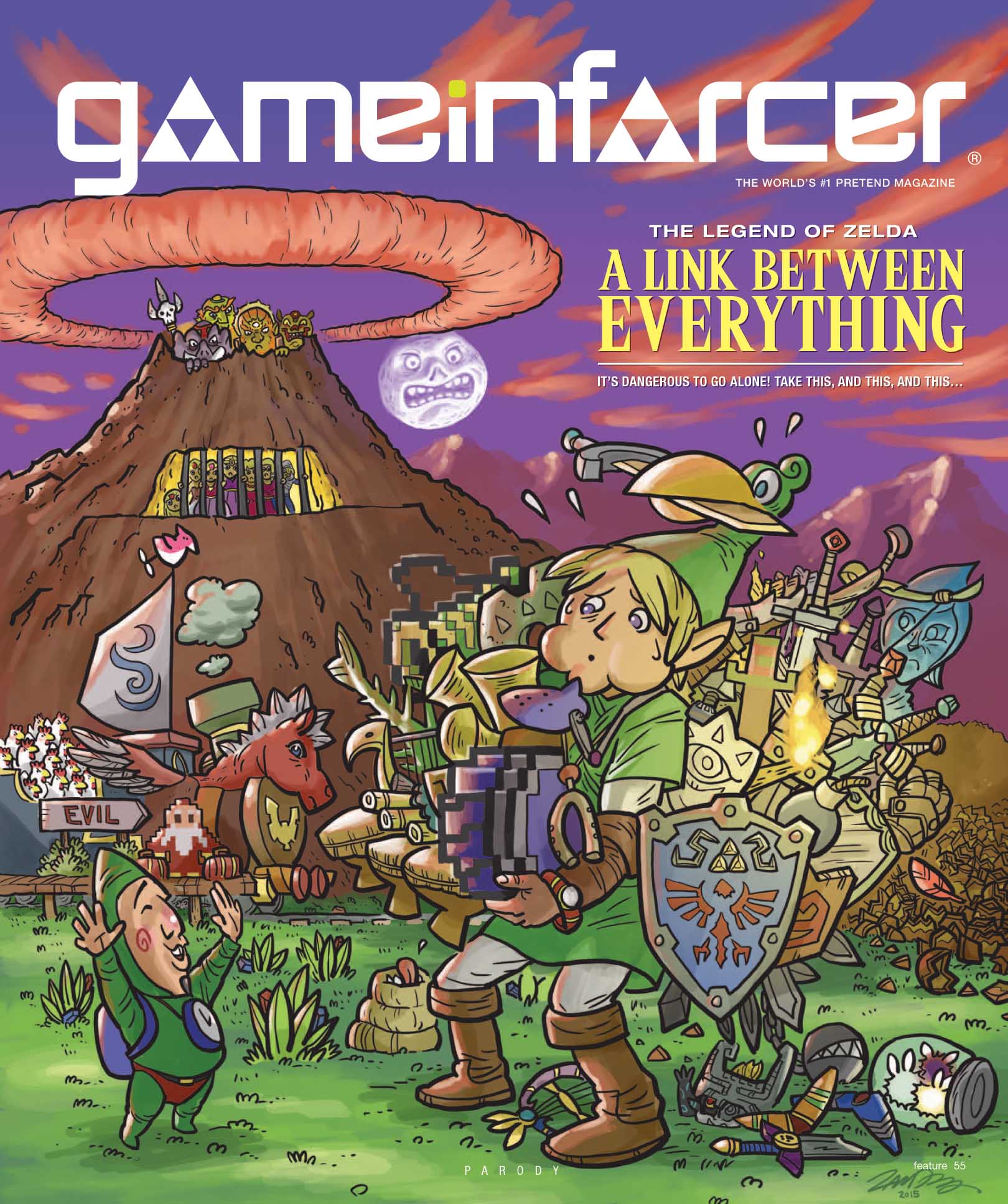
ZANDER: For most of the other covers, I had some familiarity with the games. But I had never played a single Zelda. I just remember thinking, “I am out of my depth.” So I just went hog-wild researching every little thing. I watched a zillion Let’s Plays. I was hitting you guys up for ideas, combining stuff that looked 3D and modern with stuff that was old and pixelated. I kind of feel like this one is a mess!
JEFF: For not having any experience with Zelda, you certainly nailed Epona, who is also a train and boat and bird.
JOE: Do any of you remember where that idea came from?
BEN: I don’t remember that, but I do remember feeling a little worried about the whole idea. “I love Zelda, but how funny is it to see three boomerangs?” But then you see the pile of stuff, and it works. The princesses behind the bars are funny.
ZANDER: If I could do it again, I’d make that mountain closer for maximum humor.
JEFF: I love the Like Like that just has its tongue out in anticipation of all the shields it’s going to eat.
JOE: My favorite detail on this one, which I think is easy to overlook, is just the pile of broken pots on the right.
BEN: And the rupees in the grass. It’s like, “Yeah, wait, why is there always so much money in the grass in these games?”
JOE: The original joke here was supposed to point out how similar all the Zelda games are. Like, you always get a boomerang. You always get a shield. But in the process of doing that, the illustration sort of points out how much variety the series actually has instead.
ZANDER: Yeah, when I was looking them all up, I was surprised at how much there was. So many instruments!
JOE: Also, I think those mountains in the background are pretty rad, too.
BEN: Yeah, what wedding invitation were those from?
Bloodborne 2
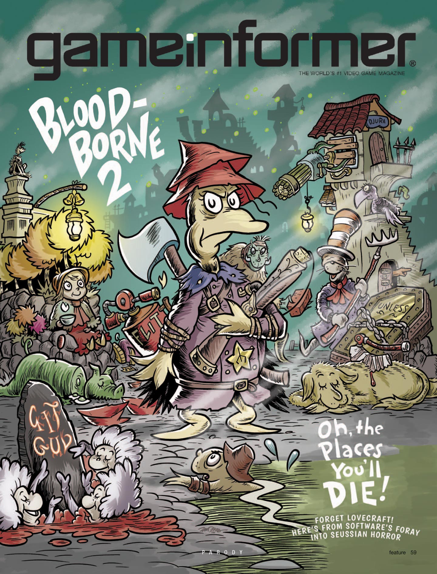
JEFF: I love this one. This is one of my favorites.
ZANDER: This is probably my favorite.
JOE: Why is that?
ZANDER: Well, I knew Doctor Seuss backwards and forwards, so it was really easy to think of funny ways to twist the Bloodborne things. There’s a giant pig? Green eggs and ham. To have Thing 1, Thing 2, and Thing 3 as the dancing skeletons. It really stuck in my mind, because it’s basically just taking all of the stuff in Bloodborne and visually translating it into a different style. In a way, it’s easy – but it also means you can do a lot.
BEN: I was really jealous this year, because I missed the initial concept meeting. So I didn’t even know what the cover was until I saw the initial sketch from Zander, but it just looked like it had been effortless. I think it came together perfectly.
JEFF: To be clear, I have the dumbest ideas normally, but the “Suessian horror” angle was my idea. I was really pleased with myself about that one – but of course, that’s nothing without this execution, which I think is just flawless.
JOE: What’s going on with all those red hats?
ZANDER: Oh, those are the 500 hats of Bartholomew Cubbins. And the “Unless” is from The Lorax.
JEFF: And you’ve got the Once-ler up on the Gatling gun, too.
BEN: What’s the guy holding the brick in the background?
ZANDER: That’s Clark, from One Fish, Two Fish, Red Fish, Blue Fish.
JEFF: I think this is the deepest cut – the pants running up the tower from What Was I Scared Of?, which I know well because I would read it to my kids. It would really scare them, but they insisted we read it to them every night.
ZANDER: I’ve never thought of myself as being particularly good at matching art styles, but it turns out that Dr. Suess is not tricky. He’s got a couple tricks, but they aren’t very hard to do. I was pleasantly surprised.
Another funny thing: I had never played these games. But after this cover, I played Dark Souls. And then I played all the From Software games, and it all started with this illustration.
Metal Gear Solid VI
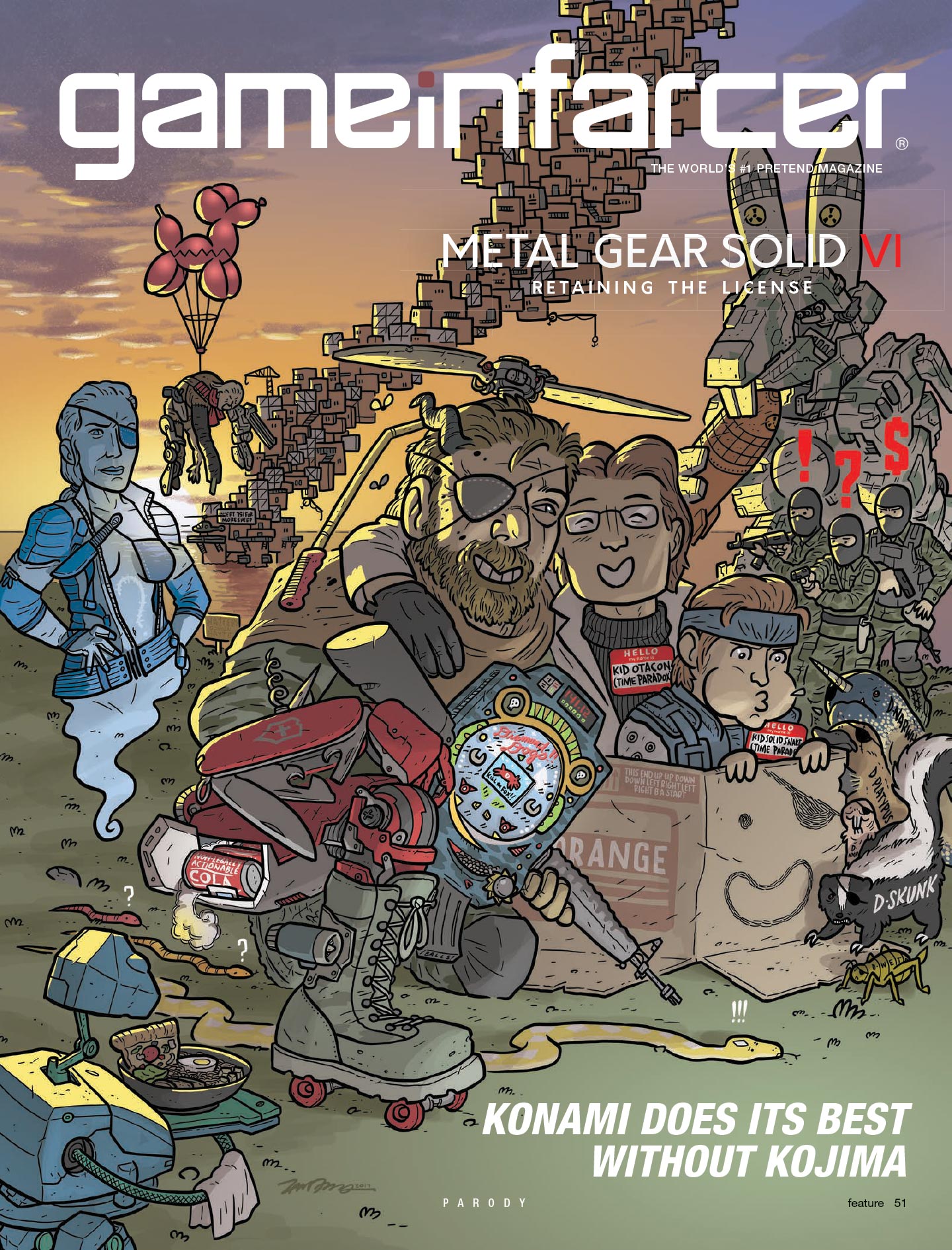
JEFF: So, this is just the Zelda one again, right?
ZANDER: Including the fact that I hadn’t played any Metal Gear Solid games. But I was still willing to dive in head-first.
JOE: I’m going to take responsibility for this one. In my head, the idea made so much sense: “Konami, having lost Hideo Kojima, will do everything possible to exploit the Metal Gear series – including reusing old ideas but making them dumber.” But after talking to Zander about it, he was like, “So, what’s the joke here?” And I just sort of insisted on barreling ahead without being able to fully answer that question.
ZANDER: If Kojima were coming back, doing “maximum Kojima” stuff, then that would be a joke to sink your teeth into. Because it would be the craziest stuff he ever did, like a victory lap for him. But Konami didn’t quite have a brand you could joke about, other than pachinko machines.
JOE: Yeah, where we landed is just taking stuff from Metal Gear Solid V and making them sillier. Now he has a Swiss-army-arm, instead of just a robot arm. Instead of young Liquid Snake, you have Kid Otacon and Kid Snake – again with nametags, by the way! The old “Pacey Technique” coming back!
BEN: I do like the D. Skunk and D. Platypus, with the eyepatches. Actually, everything has eyepatches! But like you were saying, Joe, I remember sitting around for an hour, just trying to think of jokes for Metal Gear. I feel like we had a lot of jokes, but maybe the central theme didn’t shine through.
JOE: I do like this illustration a lot, though. I don’t know anything about composition, but that central image – Snake and Otacon as buddies having a good time – really works for me.
ZANDER: I think the colors turned out nice, and I like the sky combined with the characters. And I really like the Swiss-army-arm. But my favorite joke is the three snakes on the ground: “Snake? Snake!? SNAAAAKE!”
JOE/JEFF: Ohhh!
BEN: That’s deep.
Just OK Luigi Odyssey
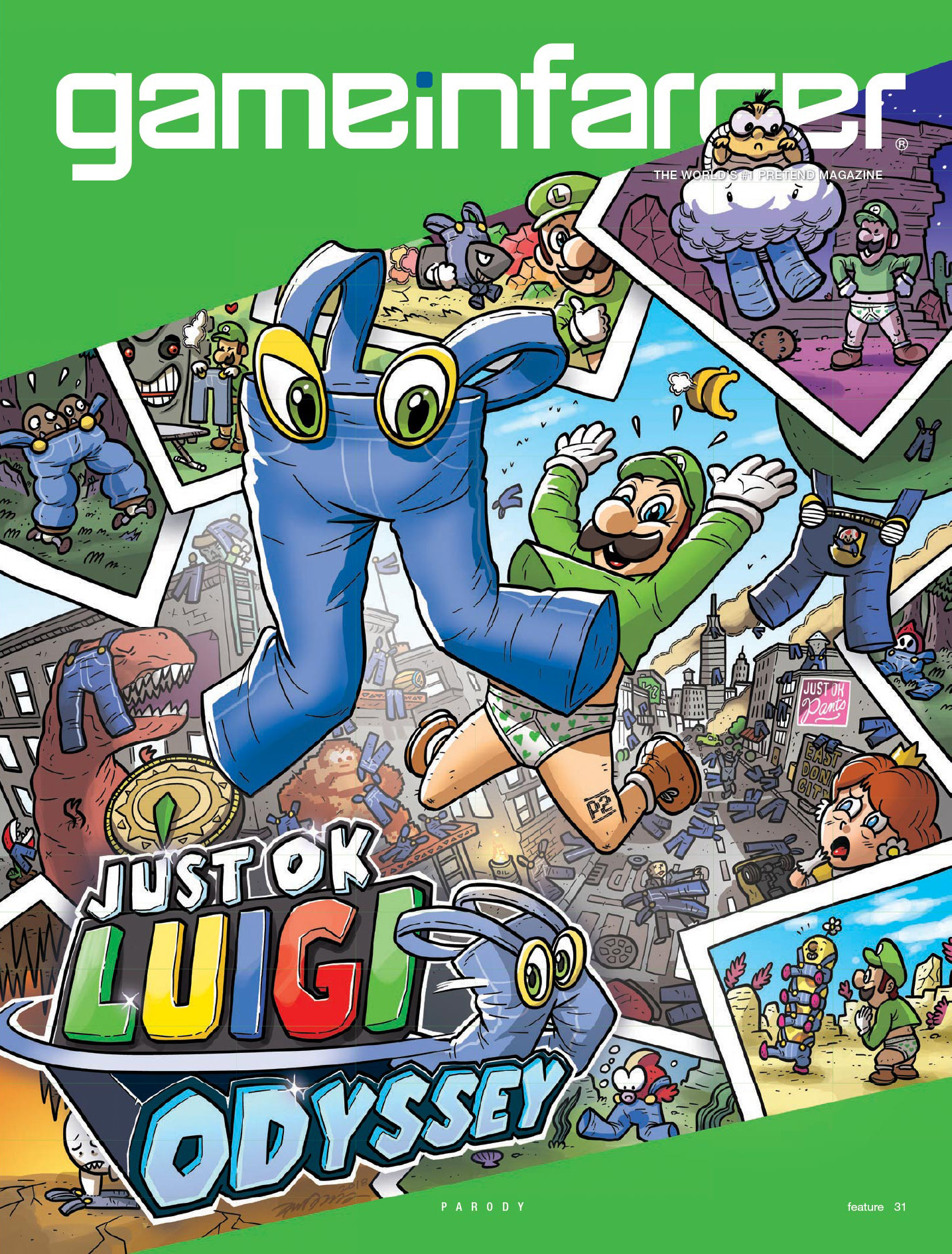
JEFF: I remember this being a really long meeting to figure out what our cover was going to be this year.
BEN: I think our idea was something to do with a Mario battle royale, wasn’t it? We talked for a really long time. And at the end of our second meeting about it, Jeff was just like, “What if we did Luigi throwing pants?” So, we were ready to move forward with an average Mario battle royale idea, and then Jeff came through at the last second with something better.
ZANDER: I remember that I knew about the battle royale concept, and I was gearing up to do something about that.
JOE: We thought Zander’s style would work so well with Mario, and with Odyssey recently releasing, we were trying to make that work however we could. I don’t think anyone loved the battle royale idea, but it checked that box. And then Jeff had the Luigi idea that checked the same box, but better.
BEN: The twist of it being pants instead of a hat is so stupid, but it also just fits Luigi’s personality for some reason.
JEFF: Yeah, the idea of characters from the Mario universe just reacting to pants is so dumb, but so funny. No one knows what they’re doing!
ZANDER: I had so much fun drawing this. My favorite is the dinosaur, who just gets pants on his head. And the Boo, who can’t touch the pants, so he’s just sadly reaching through them.
BEN: It’s also funny to me just how many Mario enemies don’t have legs. Pants just don’t work for so many of them. And I just love how happy Luigi is to be throwing his pants!
ZANDER: This is a really dumb one, but there is something satisfyingly ridiculous about it. I’m not surprised this one got some traction on Reddit. But it was more of a pain than I thought to draw. All of the pictures required a different filter so the colors would match, so it was really difficult to mask off all those things differently from the main picture. It was a surprising amount of work for something that seems simple.
JEFF: This is the deepest cut of this one: You remember how, in the logo for Super Mario Galaxy, the letters with stars on them spelled “U R MR GAY”? We used that trick on this logo, so the letters spell “U OLD.”
Spider-Man: Award Bait Edition
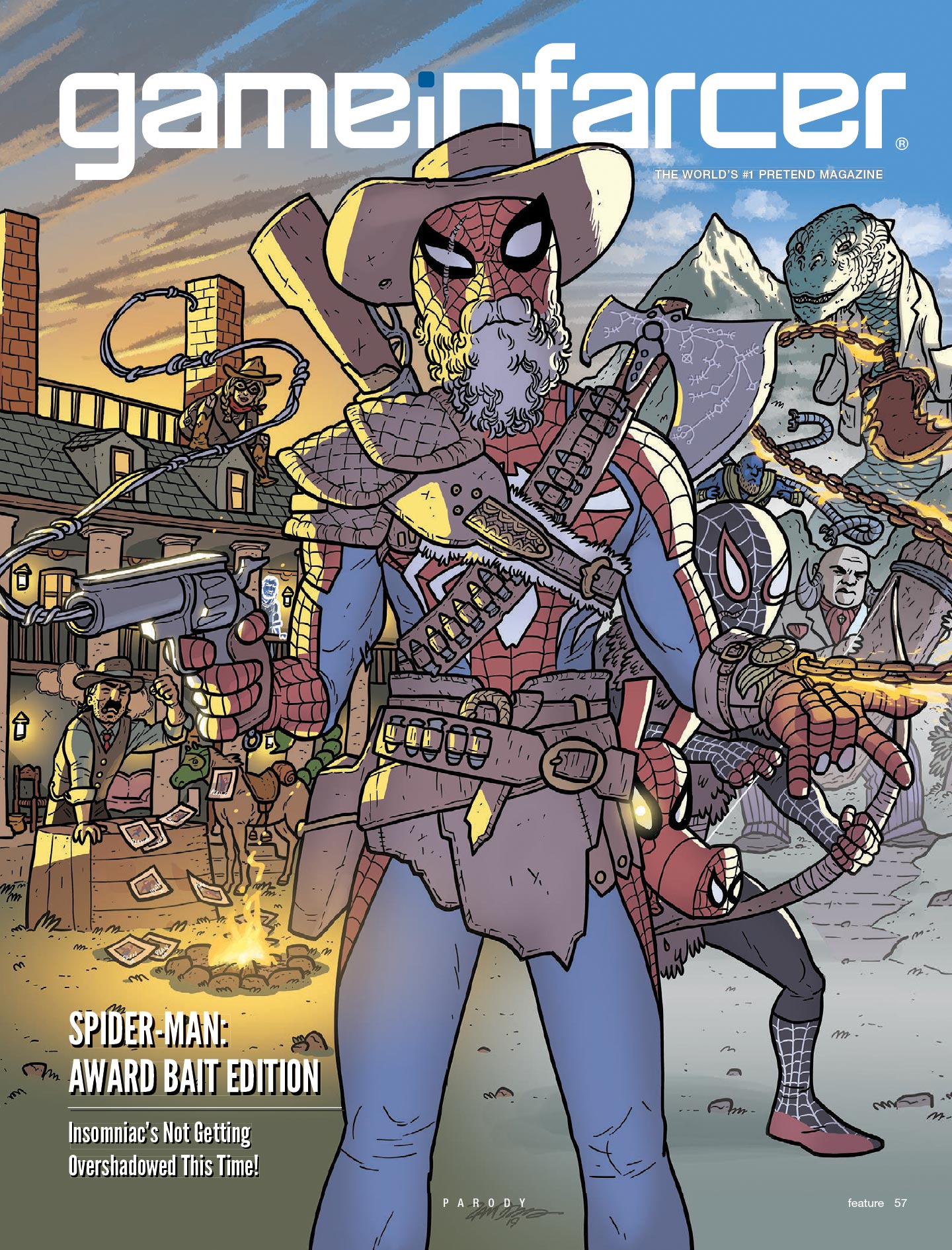
BEN: I was really excited about the idea of Peter Parker having an Old West gun that shot webs. But, I also remember us trying to find the right words – at one point, we talked about it just being an article inside Game Infarcer, instead of the cover, just because the joke needed so much explanation.
ZANDER: When that idea was sent to me, I gotta say, I knew it was going to be so much fun to draw. For one thing, I’d never drawn Spider-Man comics, so it was like, “I can finally do Spider-Man,” which is cool. And it was lucky, because I had just played through all of Spider-Man and God of War, and I knew enough about Red Dead Redemption.
JOE: I really like the different color tones on each half of the page. It’s an intuitive visual separation, with Red Dead on one side and God of War on the other. I think that lifts a lot of weight that we were worried about in terms of the concept just making sense.
ZANDER: Also, I may have been waiting my whole career to draw Spider-Man, but I’ve really been waiting my whole career to draw Spider-Ham.
JEFF: Is Spider-Man’s beard made out of webs? That is very unpleasant to look at.
ZANDER: That was the idea. I don’t know how well it comes across.
JEFF: Yuck. What’s immediately to the left of Spider-Man’s gun? Is that a ghost?
ZANDER: That’s someone from Red Dead, except as Mr. Negative. But actually, about that gun that shoots webs: Drawing a revolver with a natural-looking hand on it is kind of hard. I was extremely pleased with how that turned out.
JOE: Do you just go online and look for a reference image?
ZANDER: Yeah, you can. There’s also this thing called 3D Warehouse – this company Google bought that does simplified 3D rendering. So you can just look up a revolver, and then rotate it around until it’s the right angle. I do that on a lot of stuff – more and more, as we go. It’s really nice to take something complicated, throw it in there, and work off that.
Goose of Tsushima
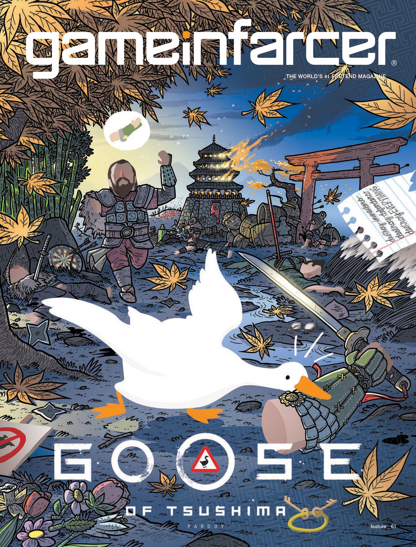
BEN: I remember pitching this idea, thinking it wasn’t going to fly because it was so dependent on the pun. But I think the fact that it was a pun involving two games helped sell it. And aesthetically, this is one of my favorites. I think Zander did a great job melding the styles from both games.
ZANDER: I remember you saying “We’re thinking of doing Goose of Tsushima, but maybe something else…” and I said “No, please, do Goose of Tsushima!” I was so excited.
JOE: Zander, I think this cover is a good example of how much you evolved as an artist over all these years. We loved those early covers, obviously – we kept asking you to come back – but it’s so clear how much you have developed your skills when you compare this cover to those.
ZANDER: A lot of time, before, I drew a complete drawing in black and white, and then I colored it. But in this, the goose doesn’t even exist on the line art. It’s just negative space. The same with all of the things with no outline. It’s nice to be able to approach it like that, instead of guessing how it would work like I had to do on paper. But I was really happy with all these colors. I did another cheating thing with those leaves; I found a couple pictures of that kind of leaf, and kept dragging them all over the page and placing them.
JEFF: One thing I appreciate about this one is how it takes a pretty gruesome concept – the goose taking this guy’s arm – but it doesn’t lean into the blood and gore. I love the idea that the goose just has his arm, like any other object. And the guy shows no more distress than if his glasses had been taken instead. “Hey! My arm! I need that!”
JOE: Once this cover was out in the wild, several people sent me links to a different artist’s Goose of Tsushima illustration. Like, they had the same idea we did … which is a bit of a bummer.
ZANDER: Yeah, it never occurred to me for a minute that this idea would have already been done. Maybe I was just too excited to draw it, and I didn’t want to ruin the chance.
Resident Evil IX
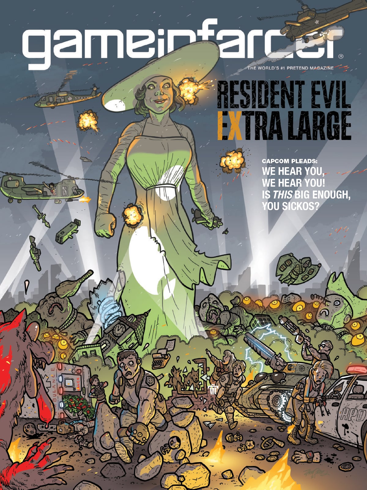
JEFF: When we first had the idea for this one, I pushed pretty hard for it, because I knew Zander would love to draw this. Because it’s basically a Kaiju, and Zander does Kaijumax.
ZANDER: And it’s very of-the-moment. She is very much in people’s headspace right now, at least judging from social media.
BEN: That was where we got the idea. Everyone had gone nuts for that lady vampire. So we circled the idea with things like, maybe other companies see that and make their characters huge. Like a giant Pyramid Head for a new Silent Hill. We kept coming up with stuff like that, but at some point, we said, “Why are we circling around it? We should just do Resident Evil, and she is just ridiculously huge.”
ZANDER: I do think it’s too bad that so many of the gags are so tiny. But I like the ambulance spilling out only herbs, and Jill Valentine trying to find the right key to the car.
JEFF: The dogs running out of the ruins of the building and still smashing through the windows gets me. It’s their thing! And the Tex-Avery-style wolf down in the corner.
BEN: I pitched the idea that Wesker should just have sunglasses everywhere, but you put a huge pair on his tank, which is also funny.
ZANDER: The tank, the helicopters, the ambulance – I used that same trick as the web-revolver. I found some 3D models and put them in as reference. That saves a lot of time.
BEN: This may have been a holdover from the Silent Hill idea, but I wanted to have Pyramid Head in there next to a sign that said “Must be this tall to get new game.” But this got pretty crowded with Resident Evil stuff, so it didn’t quite fit in.
JOE: I just can’t see the word “sickos” without thinking about that cartoon from The Onion.
CORK: Yes! Ha ha ha! Yes!
BEN: One of the other ideas we had before we settled on this one was Steampunk 1877. That could have been really cool visually, but we just didn’t have enough good gags for it. We talked too about a The Last of Us cover, but there was so much discussion about that series right as Part II came out … it was hard to find an untapped joke there.
JEFF: I really like the “Extra Large” with the IX in there.
ZANDER: Yeah, I think that was Blake [Hester] who came up with that idea. But it was fun to put all sorts of details like that in here. The tracers coming out of their guns, and figuring out how to do all the search lights, with the layers in the distance.
JEFF: Overall, looking back at all these covers over the years, one of the things that is the most fun about the whole process is, after we have our meetings about the concept, we send it over to Zander. And the fun part is when you’d send us your initial sketches, and we’d all just gather around Joe’s desk and look at them; they were always so good, and they made the whole thing come to life and feel real. Joe would do his best to sketch out a rough composition – bless him, he tries. But getting that sense of how it would actually look was always a super-fun part of the process.
ZANDER: Thanks! That always was a super-gratifying part of the process for me too, to send it in and get feedback.
JOE: And I always felt like a broken record, because I was always just saying how great it looked. It’s hard to articulate how impressive it is to see an image come in that was leagues beyond what we were thinking.
ZANDER: I looked forward to it every year. It’s never “Oh no, I have to do that super-fun illustration again!”
JOE: Well, Zander, I’m very grateful we’ve been able to collaborate for so long!
ZANDER: I really appreciate it! And it’s been fun to go through it all!
When he isn’t doing illustrations about pretend games, Zander Cannon is the creator of acclaimed comics such as Kaijumax and Heck. You can buy them <a href=”https://onipress.com/collections/kaijumax" target=”_blank”>here and <a href=”https://www.topshelfcomix.com/catalog/heck/834" target=”_blank”>here (respectively), and get other updates on his work via <a href=”https://twitter.com/zander_cannon" target=”_blank”>@Zander_Cannon on Twitter.


