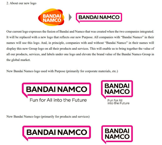
It is on this Friday, October 1 that the Bandai Namco Entertainment entity has decided to unveil its new logo, which will take effect from the next fiscal year, ie after April 2022. It must be said that it has been 16 years since the firm Japanese company had not changed its visual identity since the merger between the Bandai and Namco companies in September 2005. It was therefore high time for the Japanese company to look to the future and abandon the merger logo (both overlapping colors) for a manga bubble (which is also called fukidashi) which represents the plurality of its cultural assets (manga, video games, animation). Several versions of this new logo were also presented: spread over the length, more compact with a square format, with or without the catchline “Fun for All into the Future”, this logo will adapt according to the communication. This change has also made the Internet users react enormously, who seem to be quite divided on the design, considered too simplistic and which recalls already existing bank logos … And you, what do you think?
I immediately thought of that when I saw the logo. And I make that the first 3 letters of the editor are BAN that does not help! pic.twitter.com/Vpx79bLNrb
– Rob DE FREITAS (@rob_defreitas) October 1, 2021
