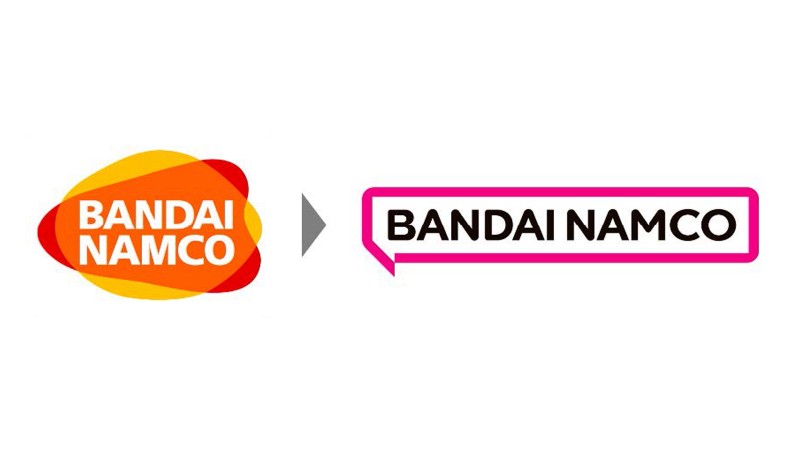
If you’re a Bandai Namco fan, it’s time to start saying your goodbyes to the red, orange, and yellow logo that has graced titles such as Scarlet Nexus, Tales of Arise, Little Nightmares II, and countless other hits. The company has unveiled a new corporate logo alongside a new mission statement: Fun for All Into the Future.

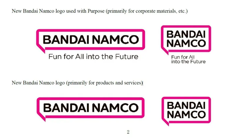
The new logo adopts a more, shall we say, minimalist philosophy. The company’s name is penned in a simple black font situated within a thick magenta border shaped like a speech bubble. According to a press release announcing the change, the speech bubble specifically signifies the brand’s potential to connect with its audience while also tipping a cap to manga culture. Bandai Namco states that while the old logo represented the fusion of Bandai and Namco, the new one better fits the spirit of their new purpose.
That purpose being the Fun for All into the Future mission statement. What does that mean? The publisher explains that it embodies its goal “to share dreams, fun and inspiration with people around the world. Connecting people and societies in the enjoyment of uniquely entertaining products and services, we’re working to create a brighter future for everyone.”
You still have a few more months to enjoy the soon-to-be defunct logo. Bandai Namco states the new logo won’t go into effect until April 2022.
So what do you think of the new logo? Share your graphic design-related hot takes down in the comments!


