The logo, along with the products, is the most important distinguishing feature of the company, thanks to which it is recognized without further ado. But sometimes the most eminent corporations with a rich history and multi-million dollar turnover resort to changing the logo. However, there are those who do not do this even under the influence of time or fashion. One of them remains the development studio Rockstar Games, the authors of Grand Theft Auto, Red Dead Redemption and many other video games. Yes, initially R * had a lot working options. But for almost 25 years now, their emblem has been a black letter R with a white star, inscribed in an orange square with rounded corners. A fairly simple and minimalistic combination that remains relevant at all times, easily lends itself to various interpretations and change of colors (see logos of other divisions of Rockstar) and does not require a redesign.
The authors tried to figure out the history of the creation of a well-recognized logo by gamers timeextension.com. After several attempts to find the designer responsible for the R* symbol, they contacted Karen Scott, who worked with the Houser brothers for a short time in the late 90s.

Karen confirms that the creators of the logo were, as suggested in book by David Kushner, Jeremy Blake, who passed away in 2007. Scott herself came to Rockstar at the beginning of 1998 (even before the formal foundation) just along with Blake. Previously, they worked for a company called Nicholson, which was based in the famous Pack Building in New York. Jeremy met Sam Houser at one of the exhibitions, and they quickly agreed on the topic of their mutual love for Stanley Kubrick films and a similar sense of humor.
We literally worked in the smallest office imaginable. At one time there was not even a table there – you had to work on cardboard boxes. There were only seven of us at the then-unnamed Rockstar: Me and Jeremy, Jamie King, Gary Foreman, Sam and Dan Houser, and Terry Donovan.
The first task, after choosing a name, was to create a logo. It was supposed to look good as a sticker for pasting public places during an advertising campaign. Because of this, the corners are rounded. For the letter R, the Helvetica Neue font was chosen, and the color was chosen due to the similarity with the Kodak emblem. Together, this gave the effect of association with the 70s and rock music – ideal for a company called Rockstar Games.
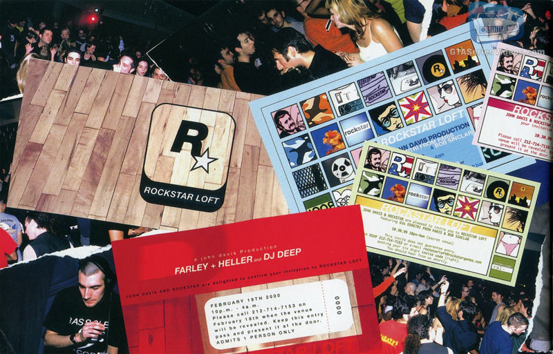
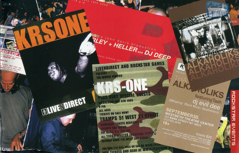
As the logo fit the name, so the employees themselves looked like “rock stars”. Karen says that R* was not a company in the usual sense of the word – there were no corporate practices, no rules.
We went to restaurants as a group and were kicked out of every place we went. I tried to reason with my colleagues, saying that this is America, you can’t do whatever you want here, here people have weapons, and it’s not clear what this or that situation can lead to. Later, when I got pregnant, I realized that this lifestyle can hurt. I left Rockstar in 2000 with Jeremy.
Source: gta.com.ua


