
Sony’s New DualSense Controller Colors Spark Debate Among PS5 Owners
Prism DualSense Color Names Draw Debate Among PS5 Players
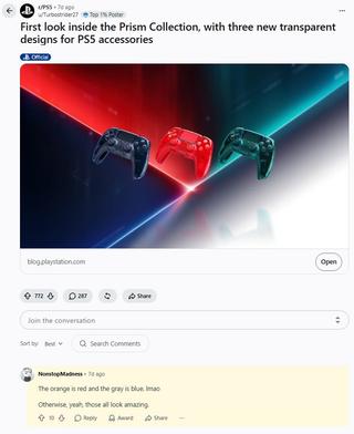
Some PS5 owners say the colors of Sony’s new transparent DualSense controllers do not match their names in promotional images.
Sony introduced the Prism Collection as a return to the transparent electronics trend of the 1990s. The line includes glossy DualSense controllers and replacement PS5 covers in three colors: gray, green, and orange. Some social media users mocked the company over the choices.
Players say the orange version looks more red, while the gray version has noticeable blue tones. In comments, users argue that the colors in the promotional images do not match Sony’s labels.
Sony’s designers said the difference is intentional. The transparent casing makes the shades change depending on the thickness of the material and the lighting. Orange takes on a pink tint in thicker areas, while gray is intended to resemble the cool color of a stormy sky. The deep green looks more dimensional because of the transparent casing.
Sony considers the effect intentional, even though some players interpreted it as a mistake in the color names.
Source: iXBT.games
Related articles
 Players Again Criticize Sony for Prioritizing Live-Service Games Over New Single-Player Titles
 Pokémon Pokopia Expansion Pass Part 2: Dazzling Decorations Brings New Accessories and More Next Month
 Study Finds New Player Habits, Raising Questions About the Future of Expensive Releases
 Mario Kart World With DLSS 5 Looks Like an Animated Movie in PC Demo
 Ghost of Yōtei Now Runs on PC Through a PS5 Emulator
 The Legend of Zelda: Ocarina of Time Is—and Always Will Be—the Greatest Game Ever Made
 Hyperkin Prepares to Open Preorders for Mega95 Handheld for Sega Genesis and Mega Drive Cartridges
 Mike Flanagan’s The Fall of the House of Usher Is an Eight-Part Netflix Gothic Thriller