An ode to OpenType: Fall in love with the secret world of fonts


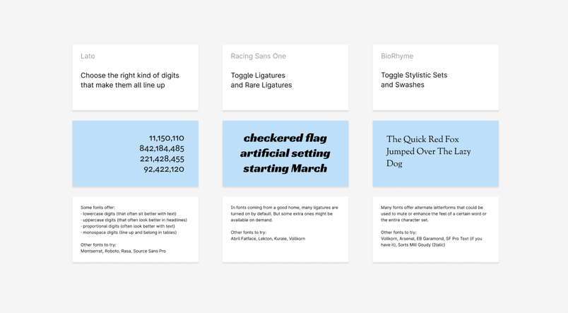
In Figma you can now turn on additional ligatures, customize the style of digits, switch to alternative letterforms, and make use of adjustments available in many of today’s fonts.
Starting today, Figma will support OpenType features of all the fonts you use: local fonts, Google Fonts, and fonts shared inside organizations. This will allow you to turn on additional ligatures, customize the style of digits, switch to alternative letterforms, and make use of adjustments available in many of today’s fonts — through a user interface that will make discovering them as much fun as using them.
If you’re in a hurry, you can jump to the description of the new functionality in Figma. But if you’d prefer a deeper introduction to the world of OpenType, read on for the tale of one designer’s love affair with it.
The mysterious double life of Warnock Pro
I remember exactly when and where I was when I discovered fonts have secrets. It happened many years ago, during one beautiful Amsterdam spring, in a small room at the Vrije Universiteit. I was working on my doctoral thesis, but things weren’t going very well. So, I did what I often do when the creative side of my brain becomes restless: I turned to typography.
I explored the university’s directory of fonts, and dove into the PDF instruction manual of Warnock Pro, one of my favorites. I’d used it before and thought I knew it well, but that day I learned it had been living a mysterious double life. The PDF explained Warnock Pro was more than it appeared: True connoisseurs of the font could move past its basic look and customize the character of its characters.
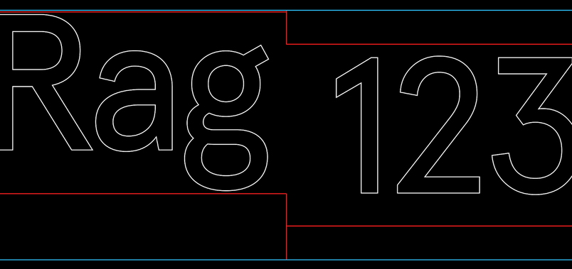
The options went beyond — far beyond — the standard bold and italic. The first thing I noticed were new number styles, named “old-style figures” and “tabular figures.” These were digits of different shapes and positions, meant to blend better than Warnock Pro’s default digits when used within text, or inside tables:
In addition to lowercase and uppercase, there was also a different, in-between style called “small caps” — meant “to introduce the first few words at the beginning of a story, or to highlight key words within text”:
I also learned that many of the letters came with hidden alternative versions, which — as the PDF explained — “have an ending flourish and could be used at the end of a word or phrase as a design embellishment”:
There was a section called “ordinals,” explaining that Warnock Pro came equipped with beautiful fractions, and what in time would become one of my favorite glyphs ever: numero:
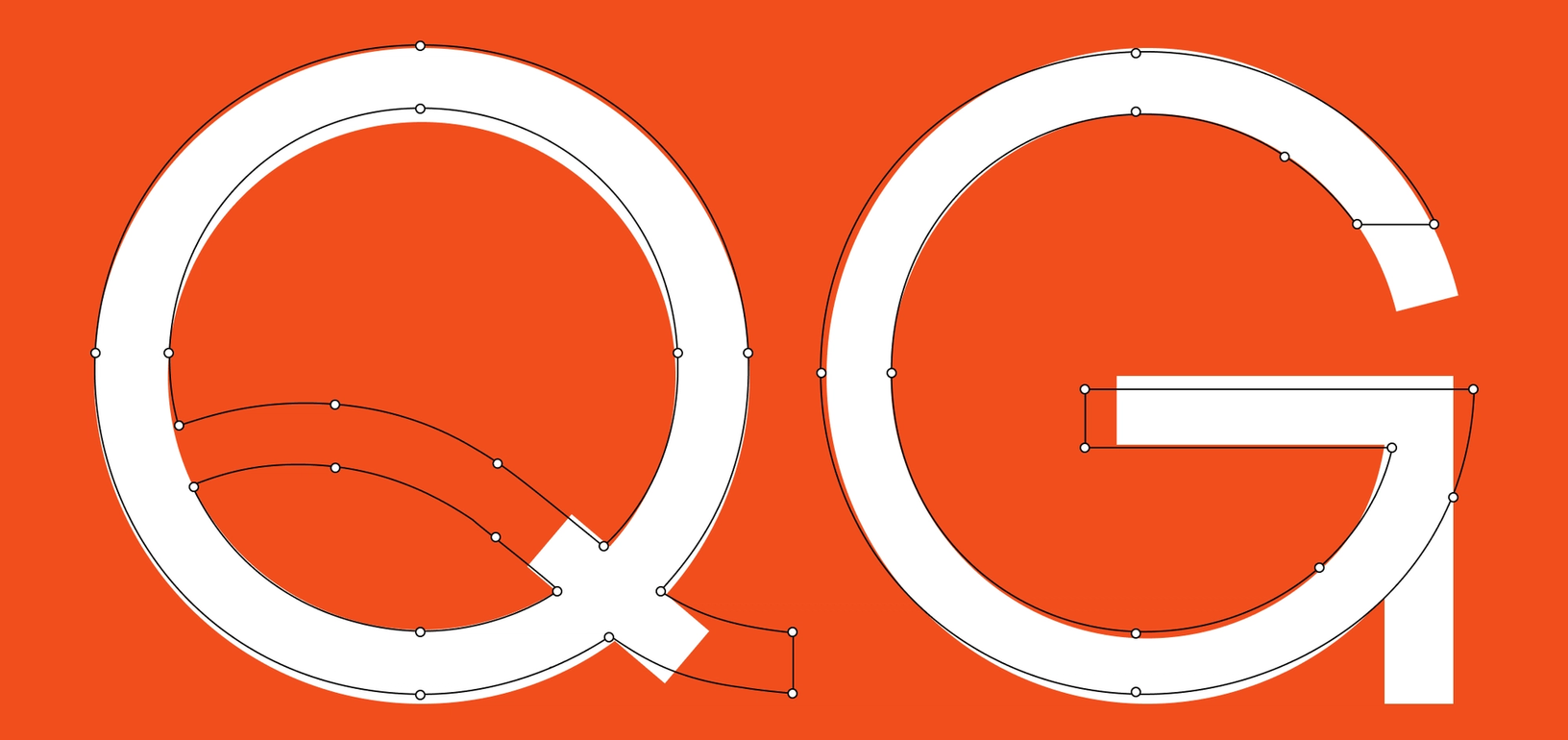
There were also “stylistic alternates,” slightly different versions of a few characters:
And, right next door, “ornaments,” a way to turn the aforementioned letters into all sorts of gorgeous symbols:
The list seemed endless, and I felt overwhelmed; the typeface I thought I knew had so much more to offer than I’d realized. The swashes, the ornaments, the extra digits — I still didn’t quite understand what many of these were for, but I wanted to use them anyway.
After a little digging, there came another shock: Warnock Pro’s secrets were accessible in some design tools I was already using! The options were bundled under an obscure technical term called “OpenType features,” hidden inside submenus, filled with checkmarks attached to scary-sounding names. It was no wonder I’d never stumbled upon them before.
In the weeks to follow I became intoxicated with OpenType. I discovered that a few other fonts also contained these features, and I filled my thesis to the brim with them.
I was like a cook discovering the world’s spices for the first time. Why had no one told me about the existence of typographic paprika, coriander, cumin, and thyme? I’d been working with plain old salt and pepper, when Warnock Pro and other fonts had an endless number of more interesting seasonings.
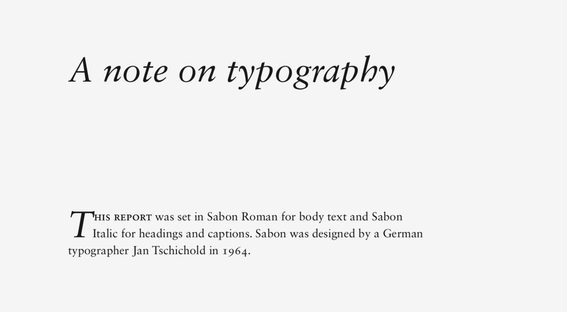
Predictably, I went overboard, applying the spices bluntly and indiscriminately. I added swashes to my chapter titles, peppered in a few different types of digits, and even snuck in an ornament or two. To top it all, I added an extra section to my thesis titled “A note on typography.” Even there, I set the first two words in small caps, and wrote out the year in old-style digits.
But clumsy as it all was, it also felt profound: I wanted to share what I’d learned with the world. This was, as far as I can remember, my first public declaration of love for typography — and OpenType features were what led me there.

The adolescent years with OpenType
Over the next few years, I made sure to open every PDF that came with a font, and inspect all the OpenType secrets hiding inside.
As time passed, more and more fonts came equipped with special seasoning options. And, in time, online type specimen pages replaced PDFs as the method for communicating them (here’s an example from a font I like a lot, although I cannot quite explain why).
Through these specimen pages, I learned that not all fonts were made equal. Some came with just a singular option that changed only one character. Other times, a font would have dozens of OpenType features, each affecting the entire character set. In those cases, enabling the feature meant watching a font transform in front of my eyes, morphing into what felt like an entirely new typeface.
Months turned into years, and my knowledge of OpenType accumulated. I came to learn the meaning of specific technical terms, like “tabular numbers” (numbers meant to be put in tables) or “discretionary ligatures” (as in: to be used at your discretion). After even more time, I started understanding the meaning of features themselves: rather than enabling them simply because I could, I paid closer attention to what problems they were supposed to solve.
One example: Just a few years ago, when I was working at Medium, we spent time figuring out how to choose the right digits for all the articles on the platform. In body text, we tried to make them as unexciting as possible, flowing well with sentences around them. For the rare pull quotes, however, we decided to do the opposite, going for headline-like digits, and a flamboyant ampersand — all hiding inside OpenType features of a font named Kievit:
Around the same time, poster designers I worked with taught me about another important OpenType feature. It turned out many fonts came with a set of slightly adjusted and re-aligned symbols and punctuation, to be used when writing exclusively in all caps, crucial in making everything feel better and more cohesive together:
And even recently at Figma, the keyboard shortcuts panel How Doug Engelbart’s famous demo inspired a designer’s lifelong obsession with keyboard shortcuts

Figma's New Finger Tips
Over and over again, whether I used typography in service of print, user interfaces, or graphic design, it continued to surprise me how often small differences like these mattered — how often the fonts and typography choices felt almost there, but just a letterform or two away from the entire project coming together.
OpenType features frequently helped find the right letterforms and save the day. From a distance, many of them appeared trivial and disposable — but just like seasoning, they became something no typographic dish could really live without. Sometimes one feature was as simple as a pinch of salt on watermelon, or nutmeg added to sautéed kale: undetectable as its own flavor, but in combination with the right ingredient, arriving at something enriching, deep, magical. The other times, it was something huge, weird, and suspect that worked surprisingly well — like chamomile and fish, or pepperoni pizza with honey.
Introducing OpenType features in Figma
Given my history with OpenType features, it’s not surprising that supporting OpenType features was my first Figma project. I proposed the idea even before officially joining, as a guest during one of the company’s Maker Weeks. (Lucky for me, the Figma team also agreed it was important to make OpenType features more accessible to our customers).
It felt important to me. The features held a special place in my heart, found at that treasured intersection of “playfulness” and “usability.” They traveled with me throughout my design career – I used OpenType features when teaching typography workshops at Google, fought for them at Medium, and enabled them in government projects at Code for America. I wanted others to discover and experience them, too – and to make that process as easy and friendly as possible.
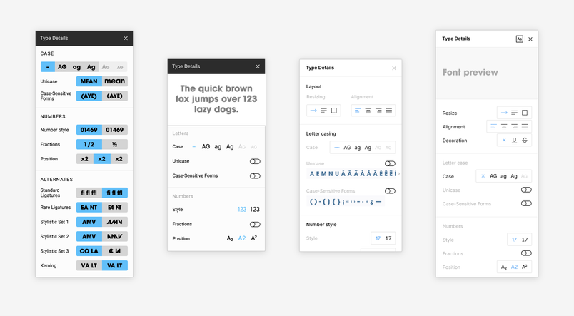
Today, I’m happy to announce Figma will support OpenType features in any font you use. Click on the three dots in the Type section, and you will see a new panel that gives you access to your font’s secrets:
We wanted to remove some of the challenges of going through PDFs and specimen websites, but without dumbing things down. It took us some time to arrive at the right balance. Here's what makes our implementation unique:
- Panel name. We do not call the panel “OpenType features,” since that’s such a highly technical term (not to mention it could be confusing, as OpenType format and OpenType features are two different things).
- Grouping and labels. Things are grouped in ways relevant to how people use Figma (for example, we moved case-sensitive forms up, and scientific inferiors down), and where we could, we chose to use friendly and understandable labels instead of jargon. (As an example, “discretionary ligatures” became “rare ligatures.”)
- Preview. We also wanted to find a good balance between showing and telling. Each feature will give you a quick preview of what it does, so you can quickly understand its effect even before applying it to your text.
- Relevance. Gray text will tell you whether the change is relevant to your text or not — so you don’t have to waste your time switching a toggle and seeing no effect at all.
- Support for exploration. We try to do a good job at remembering what OpenType features you wanted as you switch between fonts, and preserve your intent even in mixed and edge cases (like if you select text with many fonts inside).

Parting gifts: Our interactive OpenType playground and more
If you open Figma today, you’ll be able to use OpenType features in all the fonts you installed over the years. But even without any of your own fonts, Figma’s integration with Google Fonts means there’s a great starting point — just check out a little interactive playground we’ve put together. It will help you get to know the extra flavors of fonts that come with Figma.

However, the world of OpenType goes much farther than those few examples. Just like I discovered more and more features over the years, I hope you’ll carve out your own corner of the OpenType universe, and assemble your perfect OpenType spice rack. To get you inspired, I collected my personal favorites below. I hope this “best of” list will have something for you whether you’re a graphic designer, a developer, a product person, or simply a typography geek like I am.
Let’s start with some of my favorite OpenType features – those that teach about typographical legacy, revealing historical letterforms:
Other features will introduce impressive swashes…
…or modern and old-school ligatures (including some surprising combinations, for example historical ligatures in a contemporary racing font! 😮):
OpenType features will be there for programmers…
…people dealing with numbers…
…graphic designers…
…and, of course, user-interface designers (like the OpenType symbol customization recently added to Apple’s San Francisco fonts):
Sometimes an OpenType feature can be a tiny adjustment, an almost-imperceptible difference that finally makes something work…
…an alternative take on a letterform that could be a breath of fresh air…
…support when dealing with multiple scripts coexisting…
…an ampersand that will make your day & change your life…
…a party hat on an otherwise hard-working font…
…or — like in the case of a font called Avant Garde Gothic — a complete attire ready for all sorts of different parties. (Avant Garde's embrace of OpenType features is still to me, one of the most fun I’ve seen.)
In my personal typographical education, learning about OpenType features was a big step somewhere on the line from “I have a favorite font” to “one day I myself will design a typeface.” By making these features more discoverable and accessible in a design tool, I hope this might help propel you in turn on your personal typographical journey.
Perhaps Figma’s OpenType features will lead you to discover new sides of already familiar fonts. Perhaps they will help solve design challenges that felt unsolvable before. Or, at the very least, maybe they’ll allow you to have a little bit more typographical fun in your life.
And now, please excuse me as I head to my kitchen, and discover once again how much more I still have to learn about actual spices. Whether I will sneak in a quick session to explore the OpenType features of the font I just bought this morning — there is really no way of knowing.
Let us know about OpenType features you like in your favorite fonts! Tweet at us, or write to us at type@figma.com.
Thank you to Qi Linzhi, our summer engineering intern, who worked on implementing this feature. Learn more about our other open internship positions.